Current Projects

Showing posts with label Accessories. Show all posts

Monday, March 22, 2021

Hamilton - King George Crown 2.0

He said "you'll be back" and he was right.

My King George crown has been done for about two years now, and even right after I finished it I thought about the inevitable version 2.0. I've been staring at the crown for all that time but never had the motivation to jump back into it. I'd kind of moved on, both to other parts of the King George costume and just other projects entirely. But with the show being released in film format last summer, I got the bug again and started finally making steps towards version 2.0 with some specific upgrades and changes: template size, gold surface, and rhinestone details.

The main problem with the original template for the horizontal fleur-de-lis and cross band was the length. It was too long for the 24" sign I used as the base material, so the cross in the back had to be cut from a separate piece and glued in which was a little unsightly. The finished length was also longer than the band on the base hat which was about 23", creating a gap between the crown piece and the hat and widening the profile. It made the whole thing a little bobble-headed and oversized on me.

So for 2.0, I remade the template in a few different sizes. I liked the size of the individual fleur-de-lis and crosses themselves so I wanted to just shorten the length of the piece rather than completely scale it down. The only place to do that was in the gaps between the fleur-de-lis and crosses, and on the last template I basically removed that whole gap.


The finished length was almost exactly 24" and it didn't disrupt how the fleur-de-lis and crosses sit next to each other (they weren't squished too close together) so it worked perfectly.

The other, and even more problematic, big issue was the gold finish. I went through so many paints on the first version before finally settling on the Montana Gold chrome. It looked pretty dang good, even though I botched the primer and didn't get as clean a finish as I could have. But it didn't take long for the finish to corrode with fingerprints and what I can only describe as oxidization. That's because I didn't seal it, which at the time was a trade-off for not dulling down the bright finish. It's been frustrating to see the paint darken and dull, but I was able to make peace with it after deciding that first crown was a prototype and knowing I'd do an improved remake. But I don't want to use paint again, at least not spray paint, so that puts me back at square one for the gold again.

One of the first gold tests I did way back on the first crown was an adhesive vinyl/mylar sort of stuff.


At the time time I scrapped it because I couldn't get it to behave how I wanted on the curved strips: it lays nice on the outside of the curve, but on the underside the edges buckled and wouldn't stay adhered even with notches cut. But I'd loved how amazingly reflective it is. This time I played with it a little more and figured out some ways around the earlier problems, and decided that was what I'd use for the second crown.

Good color, amazing surface, pretty resilient stuff considering I've had the same sheet of it for at least six years (if not longer) and it hardly has a blemish. (The scratches and dimples on this test piece are from not cleaning the plastic surface before applying it and intentionally scratching it to see just how resilient it is.)

But then I started really comparing it to the finish on the stage-used crown instead of just hyperfixating on "ooh, shiny!" and I realized the stage crown has more of a soft finish.

Still super gold, still smooth. But it's not like a mirror. So now I'm rethinking the surface again, which continues to be the biggest challenge to this whole prop. Next step will probably be getting samples of some adhesive vinyls that are a softer, kind of brushed gold instead of mirrored to see how I like that finish. I'm also thinking about finding someone who can cut the pieces out of brass for me.

The other and most superficial upgrade is all the little bits and bobs on the crown, namely rhinestones and metal filigree stampings. What I used the first time worked really well, but there was room for improvement. I bought all the rhinestones in silver settings rather than gold, figuring they wouldn't show or I could just paint them along with the rest of the crown, but gold settings would be better (especially now that I'm not doing any real painting). Some rhinestones ended up a little too small based on my size estimates, and others I realized after more research were the wrong shape. I also wanted to add some of the filigrees that I'd skipped the first time.

So:
-5mm red cabochons and 18mm clear cabochons on the top cross -> flat-back rhinestones. The rhinestones aren't necessarily more accurate, but they match the faceted design of all the other stones so the continuity looks more aesthetically pleasing to me.
-4mm round clear individual rhinestones on the ball -> 6mm rhinestone sparse chain. The larger rhinestones better match the proportions, and the sparse chain includes the gaps between stones.
-4mm round clear rhinestones on the gold squares -> 4mm and 5mm on the squares that have oval gems, and just 5mm on the plain squares. The 4mm rhinestones kind of got lost next to everything else and the finished result looked a little more subtle than is accurate, so the 5mm will be more sparkly and ostentatious. 5mm doesn't quite fit on the edges around the oval gems, so those will stay 4mm.


-Add the setting under the 13x18 red oval rhinestones on the vertical strips. Don't know why I skipped these.
-Large cluster of 3mm and 4mm rhinestones around the 8mm clear rhinestones on the fleur-de-lis -> just three 4mm rhinestones on each side of the 8mm trio.

-6x12 navette clear rhinestones on the crosses -> 5x10 clear rectangle rhinestones. The rectangle shape looks more accurate and has a slightly larger profile so again, more sparkly and ostentatious.
-18mm round clear rhinestones in center of crosses -> 18mm square rhinestones. The square is more accurate.
-Add the rectangular filigrees to the edges of the crosses. I don't know why I skipped them last time.
-Use larger clovers and add the flat-back gold pearls around the 18mm rhinestones in the cross centers. Just more accurate. I have two options: the filigree clover which is larger and open (just wire-work, not a solid piece) or the plain setting which is solid and smaller. The solid setting is more accurate and will be easier to glue neatly, but the wire filigree has cleaner edges.


-Add extra square filigrees at the top of each vertical strip. I skipped them before because I thought the curve of the strip would be too extreme to get the filigrees to lay flat enough. This time I'm just going to make it work.
-3mm round clear rhinestones -> all removed or replaced with 4mm. Some of the 3mm were ultimately unnecessary, and the others were too small to be appropriately noticeable.

There are also some other incidental changes to materials and construction. Getting rid of basically all painting meant the ball at the top has to be shiny gold already, so I'm switching to a gold Christmas ornament for that. I'll also be adding patches of black fur to the white fur trim instead of coloring the fur.

Since I've done this once before and was pretty pleased with the result despite mostly having no idea what I was doing, I'm pretty confident in this second version.

Wednesday, September 16, 2020

Hocus Pocus - Booooooook!

Hocus Pocus is still technically on hold right now, pending the time to do it justice, so this is kind of a major throwback. But I had already started the spellbook before the rest of the project was delayed, and I decided to finish it to have a prop to carry at WonderCon when we did Jay and Ice.
__________

As soon as I decided to be Winifred, I knew I needed her spellbook. It's been on my dream prop list for a long time, and this was the perfect excuse.

By chance, we already had a book box laying around, which is how I've always wanted to make it (built-in storage is always a win).
As a bonus, it's even Disney.
It's only slightly smaller than one I was considering buying, so it works really well. I'm thinking this'll be a prop to carry around at events. Being undersized is less of a hassle, and being a first attempt I don't mind if it gets a little beat up. Then I'll go back and buy a larger box as a nicer duplicate for display and photoshoots.

I did some minor mods to the box itself (cut down and flattened the spine, which was originally very curved), then marked the placement for all the seam lines and attached pieces on the covers.
 
I found some old shoelaces that worked well enough for the raised seams, gluing those down and leaving a slight gap between them that the eventual paper coating can be tucked into.
But the hot glue soaked into the shoelaces more than I expected and I wasn't able to stitch through it anymore. So I pulled the shoelaces off, did a bunch of tests, and replaced it with strips of 2mm craft foam (cut at an angle to soften the edge and help blend it with the cover) glued down with Tacky Glue. No photos of that, but whatever. I was making steady progress at that point so I just kept rolling with it.

I also sculpted the snakes for the front and back covers, the three parts of the clasp, and the fingers for the spine, all from Premo Sculpey.


I initially planned to buy and modify toy snakes and fake fingers and sculpt as little as possible, but once I started playing with the stuff it was a lot easier and more fun than I expected, so I went ahead and did it all. The second set of snakes turned out a little rougher than the first, so those went on the back and the nicer first set went on the front. All the snake and clasp pieces were painted solid black, making sure to fill in all the lines and holes, then drybrushed with pewter, then drybrushed even lighter—just catching the edges and highest raised surfaces—with a brighter silver.

The fingers were glued to the spine with E6000, and I made the seams around the fingers and the ridges for the gathers at the snake's mouths with puffy paint. After all the base pieces were attached, I applied paper towels to the entire front/back with watered down Mod Podge, pushing it around a little to get some wrinkles and extra texture. I did a solid base coat of dark grey to mask the colors on the paper, then a solid coat of medium brown, then several different drybrushed layers of lighter browns and yellows.

I got the eye from MisterEyes on Etsy. This was the hardest piece to find, but this is better than I hoped.

After the eye was glued down (E6000 again), I made lids with more paper towels and Mod Podge and painted that to match the rest. In hindsight I should have just applied the eye first and then done all the paper towel and paint, but I had the time to set aside for doing the cover and didn't want to wait for the eye to arrive. I initially left off the eyelashes, but I have a lot of fake lashes and recently found one that's missing its pair, so I might cut that up for the eyelashes someday.

The stitching was the slowest and most time-consuming part, and the part I'd been actively avoiding, so that's what held up finishing. Dental floss ended up being a good match for the sinewy looking stitching on the book.
So I just went through doing random messy stitches. I kind of referenced the screen-used book, but mostly it was just getting the same overall look without replicating the exact placement. Once all the stitches were, I weathered them all a little with light brown paint.

The clasp pieces were glued to a metal hinge, and there's a set of magnets in the book cover and the underside of the front clasp (under the rhinestone), so the clasp actually functions.

Aside from stitches, the last big thing was just gluing all the snake and clasp pieces on, and that was that.

It was pretty handy and a good amount of fun carrying it around at WonderCon, though weirdly a lot of people mistook it for the Evil Dead Necronomicon or the book from The Neverending Story.


I haven't had another chance to bust it out, so for now it has a place of honor on the shelf in front of my Hocus Pocus wall.

I'm currently in the process of researching and prepping version 2.0, which will be more screen accurate in size and detail.

Stay tuned!

Sunday, September 13, 2020

Long Beach Pirate Invasion 2019

2019 recap continues!

After a mixed bag experience in 2017 and skipping 2018, I made it back to Pirate Invasion in 2019. We did modified Jack Sparrow and Pirate!Norrington last time and enjoyed it, but this time we went full historical with our chemise dresses. They've served us well as French aristocracy at Labyrinth and French and American middle class at Huntington Beach Revolution, and were reinvented yet again for pirate shenanigans (before we wildly distressed and weathered them for French Revolution Zombaes 2.0; this was actually their last pristine outing).

Back in February as I was prepping for HB Revolution, I did a poll on Facebook asking which side I should support. After getting the clear majority vote for America and wanting to make my ancestors proud, I decided to do an American impression. But Anglomania was always kind of in the back of my mind, so I decided Pirate Invasion was the perfect chance to finally go British. And pirates are cool and all, but I'm Royal Navy trash, so here we are.

First and foremost, this meant getting to make the Horatio Nelson portrait I wanted to do for HB Revolution.
Via Royal Museums Greenwich
Except that didn't happen. And that was really the first in a long line of failures for this event.

Most of the outfit was recycled from HB Revolution—all the undergarments, dress, hat, neckerchief, sash, shoes—and I just made tweaks as needed. The petticoats got a proper hem, both shorter and cleaner and actually finished. I used similar jewelry but swapped out a few pieces to be a little more flashy (I was aiming for a slightly more aristocratic impression, and this is a much less historically accurate event). For the hat, I just added the obligatory feathers and extra ribbon I never decided on when I first made it, and used some hatpins.


I was undecided on shoes for a while. I love, love, love my Kensingtons, but they're a little rough on my feet, especially when walking on hard surfaces (at HB Revolution, walking on the grass was a lot less fraught than on the paved paths). They really need to be stretched, but I haven't got to that yet. And of any historical-esque event I do, this is one where taking shortcuts with footwear for comfort is definitely a guilt-free option. But failure #2 was deciding to wear the Kensingtons anyway, because I have too much pride and my whole ensemble was accurate and stylish enough I didn't want to compromise. Wearing the Kensingtons wasn't a complete disaster, but the discomfort was definitely distracting at times.

We ended up being probably some of the most historically accurate costumed attendees there, which was a strange experience. At cons I usually fall in the "average to good" quality category and at reenactments I feel like I'm probably somewhere between passable and good for accuracy. But we got a lot of compliments, and I think it had to do with being (humblebrag here) good quality and detailed and also standing out aesthetically from the more stylized Ren faire steampunk-ish crowd (no shade; I love those costume genres too). I even got maybe the best compliment on one of my costumes yet: "You look right out of a painting." She went with Vermeer when Gainsborough would have been a little more on point, but I'll take it. On the flip side, two people complimented our "cosplays," someone said "Oh wow, I love the Regency," and I accidentally got into a spat over the timeline of the chemise dress (our respective insistence on worn before/during/after "the Revolution" was all just a misunderstanding over which revolution each of us was talking about, but she wasn't very gracious about it). So you win some, you lose some.

There were some bad and kind of sketchy experiences with vendors and event staff that really put a damper on the whole experience, funnily enough right at the beginning and end of the day. Everything in between was pleasant enough. And ironically, despite the event usually drawing a somewhat rowdy crowd, all the attendees (and in fairness, most of the vendors) we interacted with with were pretty excellent. I really can't say whether I'll be back for a while. There's not a lot there that's a big draw to begin with, and some of these experiences left a bad enough taste. Time will tell.

Stay tuned!

Monday, June 8, 2020

HB The Revolution 2019

(I'm slowly slogging my way through the backlog of events from the last year that I never got around to posting. Bear with me.)

Going to the Huntington Beach Historical Society's annual Revolutionary War event, The Revolution, was so much fun in 2018 that going back wasn't even a question. With chemise dresses and full undergarment sets already done, conveniently being able to go in costume was just a bonus.

I did a poll on Facebook asking which side I should support: American/French or British? A few scallywags voted British, but the overwhelming majority kept it patriotic. To be honest, my major inducement to do a British impression was because I wanted to wear a miniature portrait of Horatio Nelson c. 1781, and can you blame me?
Captain Horatio Nelson, by John Francis Rigaud, 1781, via Royal Museums Greenwich
But I did ultimately decide to go American if only to appease my ancestors.

Most of my ensemble was already done from making French Revolution Zombaes in 2018. I reused the chemise dress, sash, and most of the undergarments. To account for winter weather, I got a thicker long-sleeve shirt (cut down to elbow-length) for a new shift. To transition the costume to daywear and make it more appropriate for a middle class British North American colonist, I made a second petticoat in blue, a matching neckerchief (based on one made by The Dreamstress), a new hedgehog wig, a Gainsborough/portrait hat, and a miniature portrait of George Washington. I also wore some other vintage/antique jewelry - earrings, bracelet, and rings - from my stash. Most significantly, not wanting to wear and hide sneakers again and without any decent alternatives, I gave in and bought the American Duchess Kensingtons in oxblood I've been lusting after for ages, with the James buckles. They're admittedly a little difficult for me to wear with my foot/joint problems, but I still love them.

The hat.
With the old French Revolution Zombae wig, not the new wig


The George used in the mini portrait.
By Pierre Eugène Du Simitière, 1779, via Princeton University Library
It was chilly and breezy, not unusual for southern California in winter but definitely cooler and more blustery than the year before. (We were lucky to be there on Saturday, as on Sunday it straight up rained.) Being in thin cotton dresses, a few people asked if we were cold, but with full tights, two petticoats, stays, and a decent weight shift, we were actually quite comfortable even into the early evening when we left.
I forgot to bring cash and the library's ATM was broken so I miraculously left without any books from their Revolutionary-themed sale. I bought about 10 last year and still haven't read any of those, so really this was no big loss, though I do regret missing out on the 1776 film soundtrack record. We did find a Franco-American alliance cockade that my friend got to go with her French-inspired ensemble.

We met some fantastic people throughout the day. A photographer duo asked if they could take our photos and very kindly sent us copies after.

We also wandered into the tent of an artist who was set up selling his work and taking photos of the event, and he sent us some candid shots as well.


All in all it was a great outing, and for being my first real attempt at historical costume at a historical event I'm really pleased with the result. This will definitely be a new staple in the costume/event catalog.


Tuesday, June 25, 2019

1780s Continental Army Gainsborough/Portrait Hat

Guys, millinery is hard.

The Huntington Beach Historical Society's annual American Revolution event was back in February, and I'd been planning to attend in costume for a long time (definitively since I finished my chemise gowns in August, but theoretically even since last year's event). I had last year's French Revolution Zombaes dress and undergarments as the base, but I needed new accessories for a bit more historical realism and less theatricality. A hat was a major part of that.

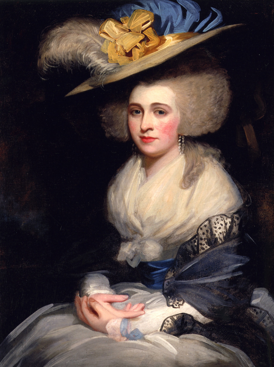
I used a lot of historical portraits and illustrations for design inspiration. Dames a la Mode's Hats From History is a great source, and this portrait in particular was one of my main starting points.
Abigail Adams Smith, 1784 via Hats From History
It took me a long time to come up with a theme and color scheme that wasn't too theme-y. I was making this for a colonial American impression.  But red, white, and blue gets real match-y real fast. I ultimately went with Continental blue, buff/white, and gold. Classic, aesthetic, and patriotic without being PATRIOTIC.

I used American Duchess's Amazing Craft Hat (Part 1 and Part 2) as a reference for construction, starting with a straw craft/gardening/? hat and reshaping the brim to give it that curve in front and back.

By chance as I was thinking about fabric options, I found navy blue silk track pants (???) and a black tulle-lined evening gown for dirt cheap at a vintage store sale. So I cut large circles from the silk and both the light and heavy tulle and stitched them together, gathered it, and glued it to the crown. (I chose not to cut the crown off the hat itself so the fabric would have a little more support if needed.)
Like actual real 100% silk track pants
  I had zero ribbon, so with my Continental theme in mind I got a few blues, gold, and off-white.
The red was an alternate waist sash idea that got scrapped and returned.
I layered some of the ribbons together and stitched/gathered those to create a trim for the crown, and did black bias tape around the brim edge.
This was the ribbon testing phase. On the hat itself I liked the right side with wider blue ribbon better, but the left looked better when worn with the white dress.

I was going to get some hatpins but ran short on time, so I did some ribbon ties at the sides instead. It's a little fussy and deformed the hat shape a little, but there's (kind of) documentation for it and it kept things secure. For future upgrades, I'll definitely be getting hatpins and maybe leaving the ties just as security but not having any real tension on them.

And that was the bulk of it done.
With my French Revolution Zombae wig, though I didn't actually wear them together.


In action at The Revolution
Just in the past few weeks I busted the hat back out for some upgrades.

Part of the reason I left it plain in February was because I couldn't decide on feathers or extra ribbon (bows, cockade, etc.). So I finally figured out a grouping of feathers I liked and made up a neat little beribboned cockade on the fly.


The cockade is a scrap of the same silk as the crown. The thin ribbon is the same from the trim around the crown, and the wider ribbon is the same as the ties. The button was from the stash.

I also tacked down the center top of the silk crown to the straw beneath to combat some problems with wind billowing the lightweight fabric too much. And I found some short hatpins in the stash. I still want a single long one that can go straight through the crown, but one of these on each side is fairly secure (if a little fiddly).

It's still not quite right to me somehow. Maybe it's still not frilly or ostentatious or large enough. But it's definitely an improvement and I'm really loving it.

Hopefully I'll get some more decent photos of this thing being worn at an outing next week.

Wednesday, December 19, 2018

Hamilton - King George: Moving Forward

Now that the crown is (finally) done, at least in Version 1.0, as well as the livery collar, star badge, and rhinestone garter, I can start getting back to the big picture plan and thinking about what's next.

Star badge:
I technically have one done, and it's alright. But I've never been totally satisfied with it (I will never be satisfiiiiiied). The show has since premiered on the West End, so I've been able to see the costuming tweaks they made for that new production. Most notably (and relevantly), they gave George an actual metal and rhinestone badge more like the real Order of the Garter rather than the embroidered one from the shows in the U.S. Either way works since both are accurate, and I'm not fussy about mixing costume variations from different shows. At the very least I could just remake the embroidered version. But I just love the way the rhinestone badge looks (*sparkles*). From seeing other people make replica royal orders and orders of chivalry and such, I have half an idea of how to make a star badge like this out of other jewelry pieces. It's an option, and it would probably be another cheap and fairly easy accessory. Time will tell.

Scepter:
I decided I had to have one after seeing the show last September, but I forced myself to put it off until all the other pieces I was working on were done. Now the time has come. I haven't really started planning construction yet. It'll probably be some kind of dowel as a base, and then I'll make the top piece similar to how I made the top of the crown. I need to do more research on it to get good references, so that'll be the first step.

Cape:
While the cape falls in the realm of clothing more than accessories and the costume can be complete without it, it's still a priority over the suit. I think I can wear it and the accessories over something silly and dumb like a red union suit or ironic t-shirt and Union Jack boxers or something as kind of a high-quality gag costume, so that I can still enjoy what I've made so far without waiting on the whole suit. By chance, I was at a thrift store in October and found a costume cape with the perfect shoulder shape. So after months of struggling with picking patterns and doing alterations (more on that later), I can actually start making some real progress on this part. I have some of the materials, though now that the pattern is different I might need to order a little more yardage (fingers crossed that it goes the other way and I'll end up with extra instead), and I still need to buy some of the ribbon trim. But overall, the mockup is ready to start at least.

This monster is still going to move forward casually and at a slow and hopefully somewhat steady pace, but it's going to be a busy few weeks around the holidays and then suddenly school starts again in January. Fingers crossed!

Thursday, November 8, 2018

Hamilton - King George Crown: Finished! (?)

It's been two years in the making, but this dumb sucker is finally finished.


I promised an unveiling, so how about an unwrapping?

This paint is no joke.
My fears about the texture from the primer were substantiated, and a lot of the surface is kind of grainy so then the chrome finish didn't turn out as well as it could have. But the top piece was the cleanest and painted the best. This is just three light coats of the Montana gold chrome on plastic and I can hardly even believe it.

And tada!
Kind of hate how dull and flat everything - even the velvet - looks here, but okay.
Up until the literal moment that I tore the plastic bags off, I was really underwhelmed. After the paint, I felt "eh" partly because of the inconsistent application, but also for reasons I couldn't really pin down. After I pulled the puffy paint mask off the rhinestones and saw those with the paint, I still felt mostly "eh." Maybe it was having been working on it and looking at it in just bits and pieces for so long, maybe it was losing perspective. Don't know. Then when I pulled the bags off and got to see the paint and the rhinestones with the velvet and fur, it suddenly clicked and I fell in love.


I still want to make an improved Version 2.0. That impulse hasn't changed at all. I'd never made anything like this before, and when I started I really wasn't sure how I was going to actually do it and if it would even work. I improvised a lot during the process, learned a whole lot too, and now there's a lot I know how to do better or differently altogether. Just for another challenge, and to be that much more extra accurate, I kind of want to do one in metal. Given how heavy this one is already, one made of metal would probably be for photos and display only, not wearing out to events anywhere. But it would still be pretty fabulous.

But at the very least, I will be making another one with pretty much the same exact materials and overall process. Most stuff I had to buy in more quantity than I needed, so I would only have to reorder a few little things. I can scale the pattern down a little to fit continuously on the 24" length of the plastic sign, so it doesn't need an extension piece and will fit the base hat and my head and frame a bit better. I can also be smarter with painting: get the good sandable primer again, then go straight to black base and the well-proven Montana gold chrome, and glue the rhinestones on last.

Having this done and feeling good enough about the whole process that I'm willing to make a duplicate has also given me the confidence to make another crown of very similar design for a costume that made its way onto my list quite unexpectedly last week, so that'll happen someday too.

In the meantime, with this out of the way, I'm getting back into what's next on this incredibly long haul project. Stay tuned!